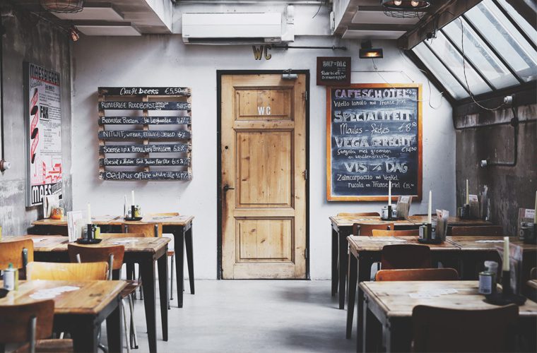
There are a lot of advantages to owning a small bar or restaurant. Of course, you’ll enjoy the lower commercial rent that comes with a smaller unit, and you’ll often use a lot less energy to run your venue than you would a larger space. Not forgetting the customer-facing benefits such as a cosy atmosphere and intimate environment.
But there are a few downsides, too. Less space means fewer tables, which can leave customers disappointed if there’s a long wait. There’s also your staff to think about. Can they work efficiently and effectively in a small space, without getting in the way?
The good news is that you can eliminate many of the challenges of a small space with a few simple yet smart design and fit out ideas that make the most of what you’ve got.
Here are 3 of our top recommendations:
1. Make use of what’s there
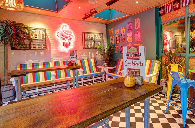
Decor can be a huge part of the customer experience in some restaurants. Consider Rumba, for example. The dining area features huge palm trees, colourful beach sofas, steel barrels, old metal signs, and lots more. And it works. But it works because it adds personality to an otherwise large, open space. When you’re working with a small bar or restaurant, these decorative elements can make the area feel cluttered and messy. So make use of what’s already there. Fireplaces, columns, exposed brickwork, old tile… whatever you have, incorporate it into the design to add character without clutter.
2. Be flexible
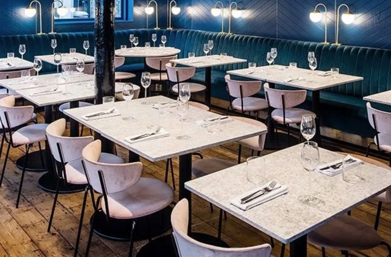
One of the biggest mistakes that small bar and restaurant owners can make is to envision a design, and stick to it. That isn’t going to work. When you’re operating in a small area, you’re always going to need that flexibility to move things around to accommodate whatever’s going on. Maybe it’s a booking for 7. Maybe it’s the need to create more space between tables, as happened during the pandemic. So opt for furniture that allows for flexibility; square tables that can be pushed up against each other to create a larger area rather than more cumbersome round tables, for example.
3. Make the most of ‘dead’ space
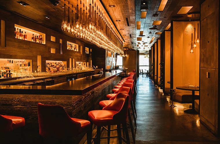
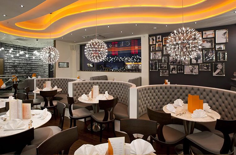
There are parts of every bar and restaurant that are unused. The trick to designing a fantastic small restaurant or bar is to transform this dead space and give it a purpose. A great example is ChaoBaby. The floor space has been perfectly optimised; there’s very little on the floor other than what needs to be there… even the booths serve a dual purpose of seating and partitioning. Almost all of the restaurant’s design elements are in what would otherwise be dead space: the ceiling. Ceiling illuminations and pendant lights build a wonderful atmosphere without creating bottlenecks for staff or customers.
